Compliance Just Got Easier: Stay ahead of regulatory changes with instant notifications on updates that matter.
['Signs and Markings']
['Signs and Markings', 'Safety Color Coding']
07/19/2024

Copyright 2026 J. J. Keller & Associate, Inc. For re-use options please contact copyright@jjkeller.com or call 800-558-5011.
:
|
InstituteSafety Color CodingSigns and MarkingsIn Depth (Level 3)Signs and MarkingsEnglishAnalysisFocus AreaUSA
Tag formats and color schemes
['Signs and Markings']
- Tags can vary according to the circumstances.
- Tags typically offer panels on both the front and back.
General requirements
The American National Standards Institute (ANSI) offers some general guidelines, which are adopted by the Occupational Safety and Health Administration (OSHA) for construction operations, but not for general industry or maritime.
A rectangular tag is standard; however, it is acceptable to round or angle the corners.
The front of a tag should contain the following panels, from top to bottom, and elements inside these panels may be centered or left justified:
- Signal word
- Safety symbol (if any)
- Message
- Signature block
The tag back should contain the following panels, from top to bottom:
- Signal word
- Safety symbol (if any)
- Message
- Instruction to “See Other Side”
The back may also offer further instructions, phone numbers, and other supporting information.
Multi-language options are also offered by ANSI.
Signal word panel format
When a safety alert symbol is used, ANSI says it should be at least the same height of the signal word (or greater) and located just to the left of the signal word. Its color scheme varies depending on the signal word.
OSHA does not mandate the colors to be used on accident prevention tags but recommends the following color scheme to correspond with signal words:
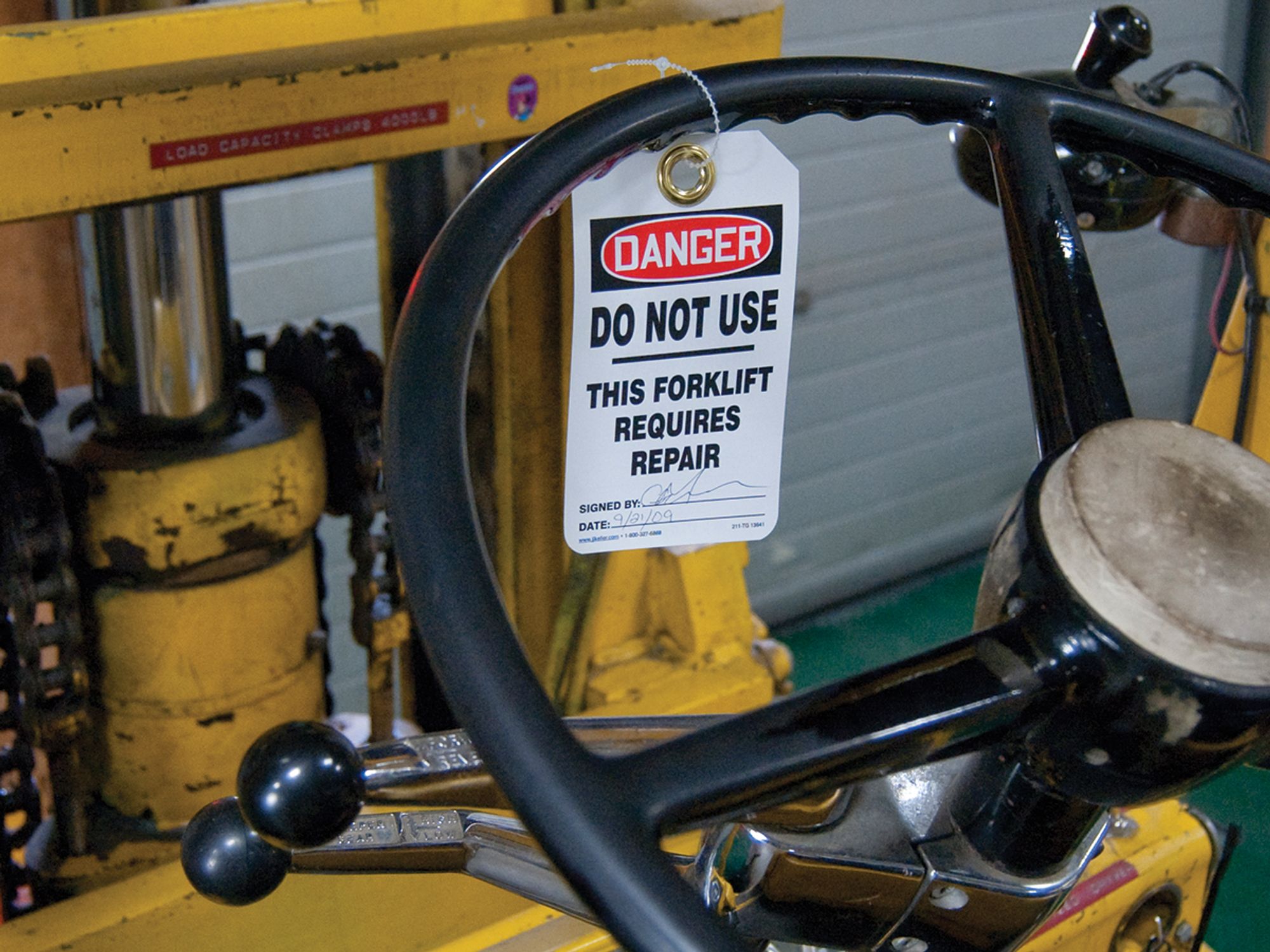
- DANGER — Red, or predominantly red, with lettering in a contrasting color.
- CAUTION — Yellow, or predominantly yellow, with lettering in a contrasting color.
- WARNING — Orange, or predominantly orange, with lettering in a contrasting color.
- BIOLOGICAL HAZARD — Fluorescent orange or orange-red, or predominantly so, with lettering in a contrasting color.
ANSI requirements for signal word panels are more detailed. However, here is a summary:
- DANGER – Red with lettering in white.
- WARNING — Orange with lettering in black.
- CAUTION — Yellow with lettering in black.
- NOTICE — Blue with lettering in white.
- SAFETY INSTRUCTIONS — Green with lettering in white.
ANSI suggests using uppercase, sans serif font for all signal words, with legibility from five feet or more.
Message panel format
ANSI generally calls for the message panel to be white with black text. Yet, there are some exceptions for the symbol panel or the back of the tag.
ANSI also suggests using a headline-style capitalization (e.g., Do Not Touch) with sans serif font. All caps may be used for emphasis or shorter messages. Also, left justification is generally recommended.
Font size must be legible from the reading distance, and ANSI offers suggested sizes. For example, for a distance of five feet, a minimum of 16 point is suggested when reading conditions are good. A larger 42-point size is suggested for that distance if poor lighting or other conditions make reading difficult.
:
signs-and-markings
signs-and-markings
FOUNDATIONAL LEARNING
Tag formats and color schemes
InstituteSafety Color CodingSigns and MarkingsIn Depth (Level 3)Signs and MarkingsEnglishAnalysisFocus AreaUSA
['Signs and Markings']
- Tags can vary according to the circumstances.
- Tags typically offer panels on both the front and back.
General requirements
The American National Standards Institute (ANSI) offers some general guidelines, which are adopted by the Occupational Safety and Health Administration (OSHA) for construction operations, but not for general industry or maritime.
A rectangular tag is standard; however, it is acceptable to round or angle the corners.
The front of a tag should contain the following panels, from top to bottom, and elements inside these panels may be centered or left justified:
- Signal word
- Safety symbol (if any)
- Message
- Signature block
The tag back should contain the following panels, from top to bottom:
- Signal word
- Safety symbol (if any)
- Message
- Instruction to “See Other Side”
The back may also offer further instructions, phone numbers, and other supporting information.
Multi-language options are also offered by ANSI.
Signal word panel format
When a safety alert symbol is used, ANSI says it should be at least the same height of the signal word (or greater) and located just to the left of the signal word. Its color scheme varies depending on the signal word.
OSHA does not mandate the colors to be used on accident prevention tags but recommends the following color scheme to correspond with signal words:
- DANGER — Red, or predominantly red, with lettering in a contrasting color.
- CAUTION — Yellow, or predominantly yellow, with lettering in a contrasting color.
- WARNING — Orange, or predominantly orange, with lettering in a contrasting color.
- BIOLOGICAL HAZARD — Fluorescent orange or orange-red, or predominantly so, with lettering in a contrasting color.
ANSI requirements for signal word panels are more detailed. However, here is a summary:
- DANGER – Red with lettering in white.
- WARNING — Orange with lettering in black.
- CAUTION — Yellow with lettering in black.
- NOTICE — Blue with lettering in white.
- SAFETY INSTRUCTIONS — Green with lettering in white.
ANSI suggests using uppercase, sans serif font for all signal words, with legibility from five feet or more.
Message panel format
ANSI generally calls for the message panel to be white with black text. Yet, there are some exceptions for the symbol panel or the back of the tag.
ANSI also suggests using a headline-style capitalization (e.g., Do Not Touch) with sans serif font. All caps may be used for emphasis or shorter messages. Also, left justification is generally recommended.
Font size must be legible from the reading distance, and ANSI offers suggested sizes. For example, for a distance of five feet, a minimum of 16 point is suggested when reading conditions are good. A larger 42-point size is suggested for that distance if poor lighting or other conditions make reading difficult.
2656867510
2656869914
UPGRADE TO CONTINUE READING
J. J. Keller is the trusted source for DOT / Transportation, OSHA / Workplace Safety, Human Resources, Construction Safety and Hazmat / Hazardous Materials regulation compliance products and services. J. J. Keller helps you increase safety awareness, reduce risk, follow best practices, improve safety training, and stay current with changing regulations.
Copyright 2026 J. J. Keller & Associate, Inc. For re-use options please contact copyright@jjkeller.com or call 800-558-5011.